A Brand Transformation
When it comes to marketing and branding, one of my most rewarding journeys was the transformation of Aahana Organics, a project that exemplifies the power of rebranding. The challenge was clear – how do we take an established brand and breathe new life into it, making it relevant for today’s audiences while honoring its rich heritage?
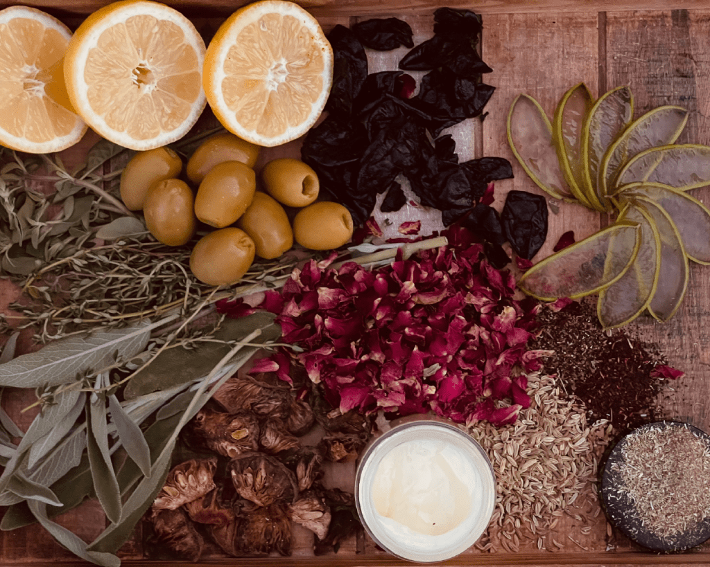
A clean, conscious brand that strives to be:
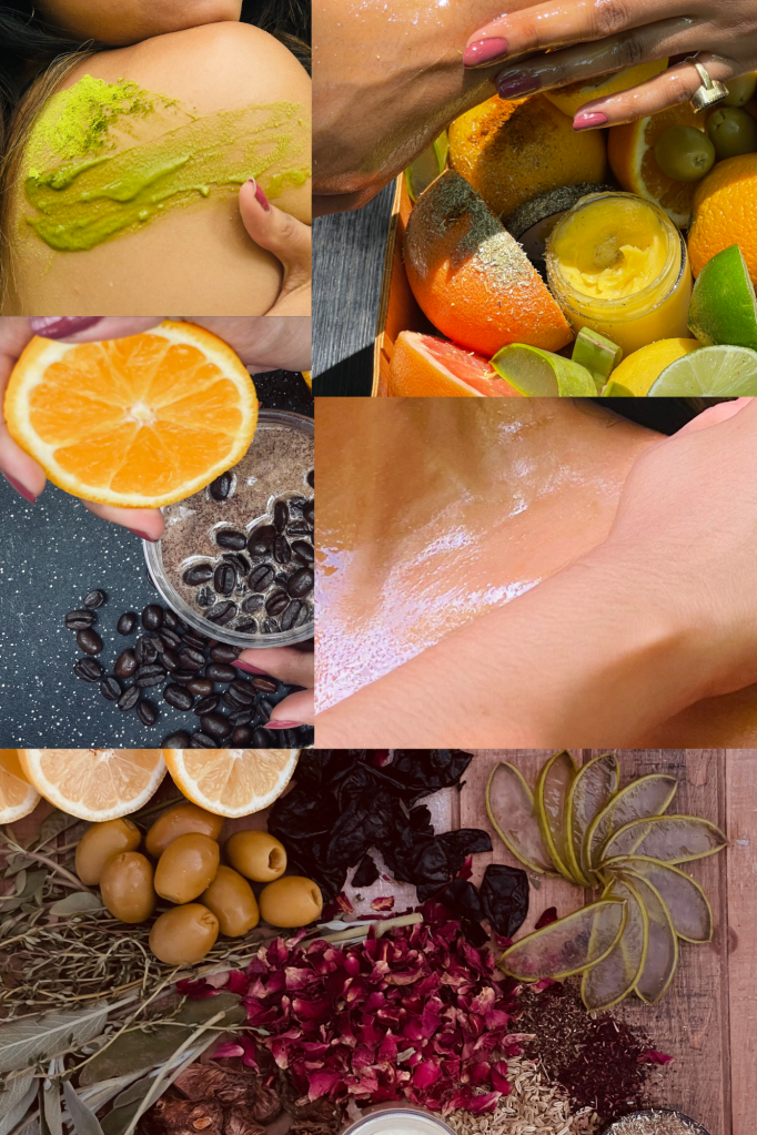
- Organic
- Natural
- Vegan
- Handcrafted
- Food Grade
- Nut Free
- Soy Free
- Gluten Free
- Preservative Free
- Homemade
- Small Batched
- Customizable
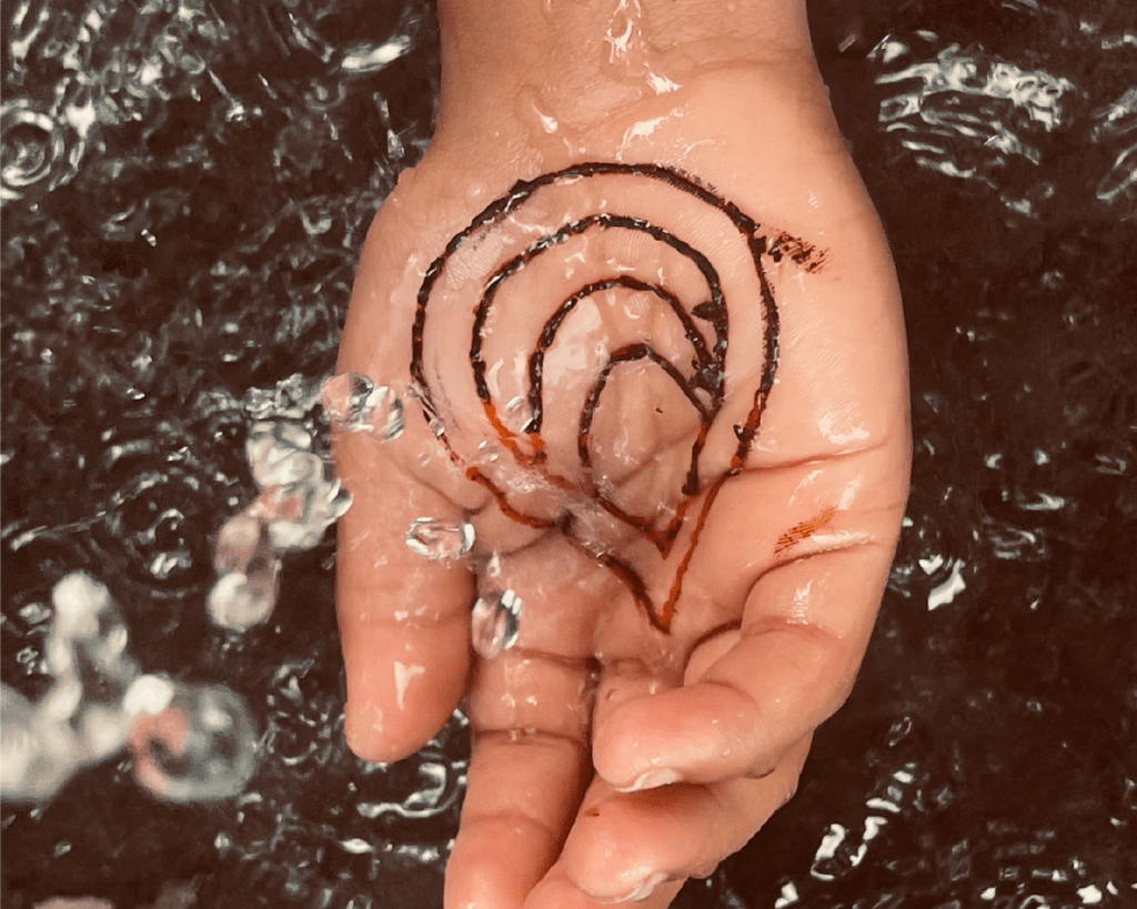
Logotype
We transformed the brand’s logo from a cluttered, blurred image to a minimalist and youthful design, embracing the brand’s essence through stylized typography. The new logo embodies Aahana Organics’ spirit, capturing its commitment to simplicity and authenticity.

Color Scheme
The brand’s color scheme mirrors its essence – calm and earthy hues that exude natural elegance. Inspired by the five elements of Ayurveda (aether, air, fire, water, and earth), these colors harmoniously blend tradition with the beauty of nature.

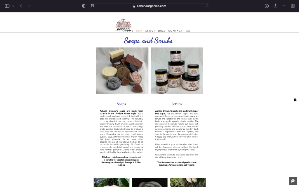
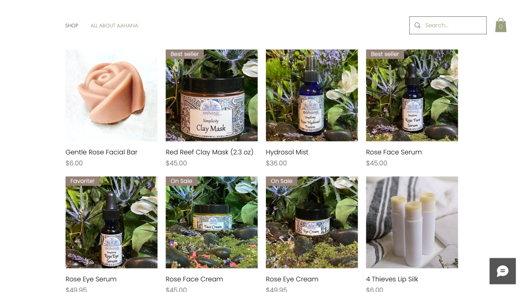
Visual Transformation
Aahana Organics’ visual identity took on a new life, encapsulating its core values. The logo, colors, and packaging were revamped to symbolize the purity of nature and the brand’s commitment to organic, clean beauty. The results were visually striking, leaving no doubt about the brand’s authenticity and values.
Before


After


Note: The rebranding of Aahana Organics was a collaborative effort; I worked alongside a dedicated team to bring this transformation to life.

Leave a comment